From Paper Form to Screen: What Carries Over?
Paper form to screen: see how fields, instructions and sequence change in digital interfaces, and learn which familiar cues still help people respond.
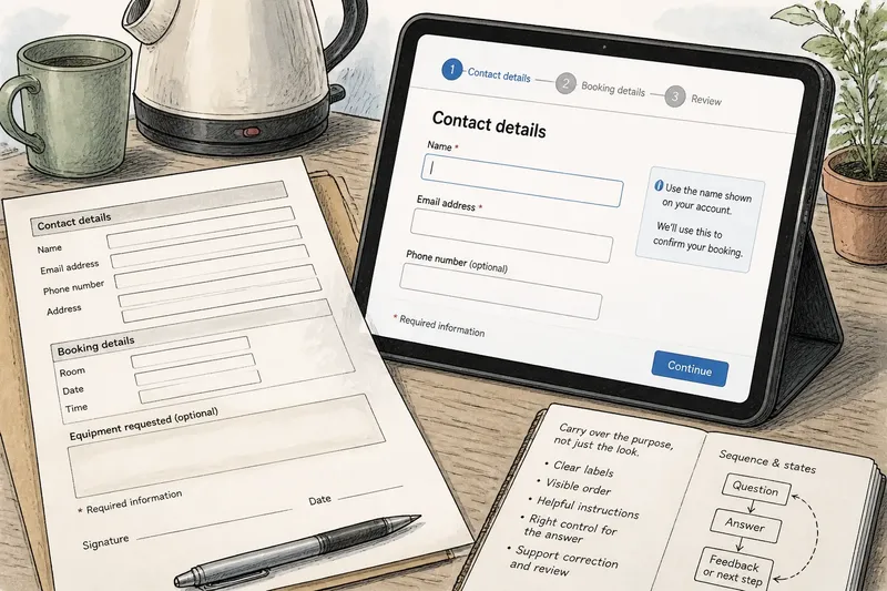
A paper form lands beside the kettle, its boxes waiting for a name, an address and a signature. On screen, those same requests may unfold one at a time, with a cursor blinking in the first field. The shift from paper form to screen is not a matter of copying boxes into software. It changes how fields, instructions and sequence do their work, while some familiar cues remain useful.
What carries over?
The basic contract carries over: a form asks for information, signals what belongs where and shows how to respond. A label such as “Email address” still names the task. A blank area or outlined field still marks a place for an answer. A heading still groups related questions, and a clear order still helps a person move through them.
But recognition is not the same as equivalence. A paper box is visible whether it is empty or filled. A digital field may change when selected, reveal an error, open a calendar or disappear after a previous answer. Paper presents the page as a stable object; an interface responds to input. The design must account for that behaviour.
Think of the printed form as a map of available space and the digital form as a sequence of possible states. Both can communicate the same request, but only the screen can react as someone answers. The best carry-over preserves the purpose of a familiar cue, not necessarily its exact appearance.
What is a field for?
A field is a promise about the kind of answer expected. A short, narrow box suggests a compact response; a larger area invites more detail. Labels, examples and input controls all help define that promise. When a form moves online, each field also has to work with a keyboard, a touch screen and, where relevant, assistive technology.
On paper, a printed line can be labelled above or beside the space. That arrangement stays fixed. On screen, labels should remain clear as a person focuses the field and begins typing. A faint prompt inside the field may vanish when the answer starts, so it should not carry the only explanation of what is being asked.
Fields also need to distinguish required information from optional detail. A printed form can use a symbol and explain it in a note. An interface can mark a required field, but that mark needs a nearby explanation and a clear reading order. If someone reaches the end and discovers an unmarked requirement, the form has made its own rules hard to see.
Different answers call for different controls. A date might be entered in a text field or selected from a calendar; a choice among a few options might use radio buttons; several independent selections might use checkboxes. The control should match the shape of the decision. Turning every question into a blank text field asks people to invent a format the form could have made clear.
Why do instructions move?
Printed instructions often sit at the top of a page or beside a cluster of questions, where they can be read before the answer is written. Digital interfaces can place guidance close to the field it explains, show it only when needed, or provide feedback after an answer. That flexibility is useful, but it can also hide information that a paper reader would have seen at a glance.
Good instructions answer the question that is likely to occur at that point. “Use the name shown on your account” is more actionable than “Enter your name” when the form has a specific naming requirement. A format hint can show the expected style, while an example can clarify an unfamiliar term. Keep examples visibly separate from the user’s own answer so they are not mistaken for entered content.
Error messages are another instruction, not merely a warning. “This field is required” identifies a problem but leaves the person to locate it. A message beside the field can say what is missing and what to do next. If the form also displays a general error summary, the summary should link or point clearly to the affected question.
Not every instruction deserves a tooltip, a pop-up or a separate help screen. That extra machinery is not worth the effort when a short label or one nearby sentence will do. A person should not have to hunt for the rule that makes a field answerable.
How should the sequence work?
Sequence is the order in which a form asks for answers and the way it signals progress. A printed page usually exposes several questions together. A digital form can retain that overview or divide the task into screens. Neither approach is automatically simpler: a long page may feel dense, while a sequence of small screens can make the whole task hard to judge.
Group questions by a reason the person can recognise, such as contact details, delivery preferences or a declaration. Keep each group coherent. If a later answer depends on an earlier one, make that relationship visible, and avoid asking for the same information twice unless there is a clear need.
A progress indicator can help when a form has distinct sections, but it should describe real progress rather than create false certainty. A label such as “Contact details” tells the person where they are; “Section two of four” can also signal how much of the route remains. A vague bar with no explanation may look polished yet tell the reader little.
Consider what happens when someone goes back to change an answer. Earlier entries should remain available, and any newly relevant question should appear without scrambling the rest of the form. The sequence is not only a forward path; it must also support correction and review.
How can a form adapt?
A digital form can reveal follow-up questions only when they apply. That can remove irrelevant prompts, but the change should not make the person wonder whether the form has skipped something. Use a direct question and a visible response, then make any additional field appear in a way that is easy to notice and understand.
Say a community centre is moving a paper room-booking form online. The printed sheet asks everyone for a room, a date and a time, then offers a box for equipment requests. In the digital version, the centre could ask first whether equipment is needed; if the answer is yes, it could reveal a short list of available items. The expected observable result is that people who do not need equipment can continue without scanning an irrelevant list, while those who do can see the available choices before submitting.
That adaptation should not erase the larger structure. If a field appears conditionally, its label and purpose still need to be plain. If a person changes the earlier answer, the interface should handle the now-unneeded response sensibly and make the result clear. The underlying form should remain understandable even as its visible parts change.
What should happen at submission?
Paper forms make completion visible through handwriting, ticks or a signature. A digital interface needs its own clear signals: which answers have been accepted, whether something needs attention and what happens after submission. A button labelled “Send” may be adequate for a simple contact message; for a formal request, a more specific label can better describe the action.
Before submission, provide a way to review answers when accuracy matters or the form is lengthy. Keep the review legible and make corrections easy to reach. If the interface rejects an answer, retain what the person entered so they can amend it rather than start again.
After submission, show a confirmation that identifies the action completed and gives a useful next cue. That might be a reference for later correspondence or an explanation that someone will respond. Do not imply that a request has been approved merely because the form was received.
Which questions come up?
Should an online form copy the printed layout?
Not necessarily. Preserve the meaning and grouping of the original questions, then arrange them to suit the screen and the way people answer. A print layout may use columns or page breaks that become awkward on a narrow display.
Do digital forms need fewer fields?
They need fields that serve a clear purpose, not an arbitrary reduction in number. Removing a necessary question can create confusion later, while asking for information that does not affect the task adds friction. Review each field for its role and explain any requirement that may seem unexpected.
Are placeholders suitable as labels?
They are poor substitutes for persistent labels because the hint can vanish as soon as a person starts typing. Use a visible label to name the field, then add a short placeholder only if it contributes an example or format cue that remains helpful.
When should a form use multiple screens?
Separate screens can help when a task has meaningful stages or when each stage needs a focused set of questions. Keep the stages named, make progress understandable and preserve answers when someone returns to an earlier section. A single screen may be clearer when the form is brief and its questions belong together.
Keep the promise clear
When translating a paper form to screen, start by asking what each field promises, what each instruction clarifies and why the questions appear in that order. Then preserve the cues people already understand—labels, grouping, clear choices—while using the screen’s ability to respond with care. The aim is not to make the interface look like paper. It is to make every request, change and next action legible.
Before releasing the form, read it from the first question through confirmation using only the controls a person would use: keyboard, touch or a screen reader. Check that labels still make sense when fields are empty, that errors point to a repair and that the final message says what happened. Those small checks keep the familiar promise of a form intact, even when its page no longer exists.