Serif or Sans Serif for a Long Page?
Serif or sans serif for a long page? Compare letterforms, spacing, size and reading context to choose type that feels clear across an extended text.
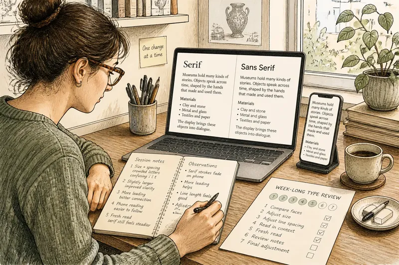
You settle in to read a long page, then find your eyes snagging on the lines before the story has properly begun. The serif or sans serif choice may be part of the problem, but the typeface’s details, its spacing and the screen or page around it matter just as much. A week-long review gives you room to judge the whole reading experience instead of picking a winner by reputation.
A week of reading
Use the week to compare a small, controlled set of type treatments. Choose a representative passage from the page: include ordinary paragraphs, a subheading, a list and any links or emphasis that recur. Keep the wording identical in each version. If the content changes, you will be judging the writing as well as the type.
Make two initial versions. Set one in a serif face and the other in a sans serif. Choose faces suited to extended text rather than display lettering: a quiet book-style serif and a humanist or neutral sans are useful starting points. Avoid pairing a delicate serif with a heavy sans, or a narrow face with a broad one. Such contrasts make the comparison harder to interpret.
Try the routine across five reading sessions, then use the remaining days to review the notes and adjust the strongest candidate. Read at a familiar pace and in your usual setting. If you commonly read on a phone during a break, include that context; if the page is meant for a printed handout, assess the printed page. The purpose is not to imitate a laboratory. It is to notice the conditions under which this particular page is used.
- Session one: Compare the two faces at the same size and line spacing. Note where letters look crowded, fragile or hard to distinguish.
- Session two: Change the size slightly while keeping the faces and passage fixed. Notice whether small details become clearer or lines feel unwieldy.
- Session three: Compare line spacing. Look for text that feels compressed against text whose lines seem disconnected.
- Session four: Read at the intended line length and in the intended setting. Watch how often your place is lost at the end of a line.
- Session five: Revisit the versions without checking your earlier preference first. See whether the same qualities matter on a fresh read.
On the final days, choose one promising treatment and make a modest adjustment to either size or spacing, not both at once. Then reread the passage. This reveals whether the improvement came from the typeface itself or from the settings around it.
Letterforms in context
Serif letters have small finishing strokes at the ends of some main strokes. Sans serif letters omit those details. That visible difference can influence texture and tone, but it does not settle whether a long page feels easy to read. Serif faces vary in contrast, proportions and openness; sans serif faces vary just as widely in width, shape and rhythm.
Look closely at letters that are easy to confuse in the chosen face and size. The lowercase “i”, “l” and “t” may be distinct or very similar. The shapes of “a” and “g” also vary between typefaces. Examine punctuation and numerals if the page includes dates, prices, code or technical terms. A face that suits flowing prose may make a dense run of labels or figures less legible.
Serifs can help a line of text feel connected, while a sans serif can offer open, direct shapes. These are tendencies to inspect, not rules about how people read. A sturdy serif with generous forms may feel clearer than a tightly drawn sans serif. A calm sans serif may be more comfortable than a high-contrast serif whose fine strokes seem weak on a particular display.
Spacing and scale
Size is more than a number in a design file. The apparent size depends on the face’s proportions, the display and the distance from which it is read. Compare the type on the intended device, not only in a design preview. On a printed page, check the actual sheet under ordinary lighting.
Line length changes the rhythm too. Long lines can make it harder to find the next line’s starting point; very short lines interrupt phrases and produce frequent returns. A page should offer a comfortable measure for its format, rather than forcing the same width onto a laptop, a phone and a printed column.
Line spacing needs a similar judgement. Tight leading can make paragraphs look dense, especially when the type has tall letters or generous shapes. Excessive leading can break the visual connection between one line and the next. Adjust it until the text feels like a coherent block without appearing cramped.
Say you are setting an invented museum article with long paragraphs and occasional captions. The first draft uses a fine serif that looks elegant on a large monitor, but its thin strokes fade on a smaller screen. You switch to a more robust serif and open the line spacing slightly; the expected visible result is steadier letter shapes and clearer separation between lines. If the page still feels heavy, you can compare a similarly open sans serif rather than assuming the category itself was at fault.
Reading questions?
Is serif better for long reading?
Not by default. A serif face may suit the tone and texture of a page, but its exact design and the reading conditions matter more than the category label.
Is sans serif clearer on screens?
Some sans serif faces remain crisp at small sizes, while others have cramped shapes or weak distinctions between letters. Check the actual screen and settings the page is designed for.
Should a long page use one typeface?
One well-chosen text face is often enough for the main reading flow. A second face can distinguish headings or interface details, but too many competing forms make the page feel unsettled.
What should change first if text feels tiring?
Check whether the type is too small, the line length too long, or the spacing too tight before replacing the face. Change one setting at a time so you can tell which adjustment helps.
Match the page
Type also speaks through its relationship with the subject. A formal essay, a friendly service page and a dense reference entry may call for different voices. A serif can lend a page a literary or editorial tone; a sans serif can feel plainspoken or technical. Neither impression is automatic, so judge the chosen face beside the actual headings, illustrations, links and surrounding design.
Consider the page’s practical demands. A screen with limited width may call for a face that stays open at smaller sizes. A long printed essay may have more room for a measured line length. A page with frequent links needs enough contrast between body text and interactive elements, without making every underlined phrase compete with the prose.
Accessibility belongs in the decision, not as a final cosmetic check. Readers vary in visual comfort and preferences. Letting people enlarge text, supporting sensible line spacing and avoiding fixed layouts that break when text grows can matter more than choosing a fashionable category. Where a design system sets type rules, check how its text behaves when users change display settings.
Keep only useful tests
It is not worth comparing a dozen near-identical faces or debating the abstract merits of serifs. That effort can distract from obvious problems such as weak contrast, crowded lines or text that cannot enlarge. Keep the shortlist small and tie each comparison to a real reading condition.
At the end of the week, record the reason for your choice in concrete terms: the lowercase forms stayed distinct at the intended size; the line length worked on the target screen; the page’s tone suited the subject. That note makes the decision easier to revisit if the layout changes. For a long page, serif or sans serif is a useful starting question, but the best answer is the face and setting that let this page’s words hold together comfortably.